Purple Gator

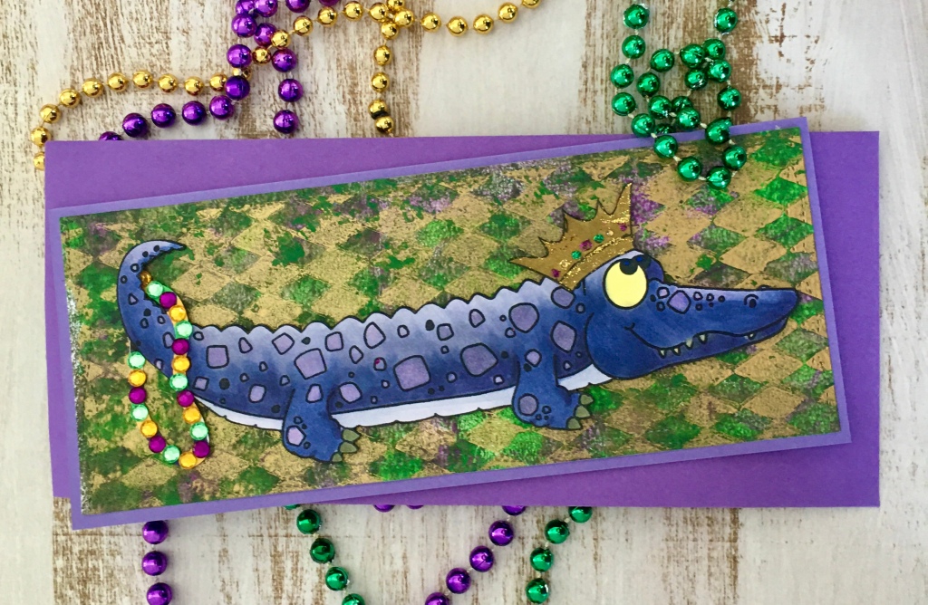
Every once in a while, I see a stamp that really appeals to me and I KNOW exactly how I want to use it. This alligator from Trinity Stamp Company is one of those stamps. It’s a 4 X 8 set called Oh, Snap and has so many possibilities. Me, I saw a Mardi Gras partying gator!

Purple, green, and gold are the main colors universally associated with Mardi Gras and I wanted to make him a little different than your typical alligator so I colored him purple with my Copic markers. (Aside here…I really wish that Copic could come up with more/better purple colors!) I had a picture in my head-sort of- of what I wanted the background to look like and although I played with distress oxide ink sprays and pads I just wasn’t satisfied with anything I came up with. I have a pretty healthy paper stash and am pretty sure I have some Mardi Gras paper but couldn’t find it. That’s okay because it made me have to go another route and I am SO happy with the end result.

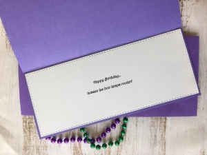
As I was going to sleep the other night, I had an idea of how to make the background I saw in my head with my Gelli plate. Thank goodness I remembered that idea the next morning! So often those thoughts drift away with my dreams. I got my plate, some paint, and stencils out and went to town playing with combinations. I ended up with lots of cool prints I’ll be using in the future but as soon as I picked this one up, I knew it was the one! I used the Tim Holtz Harlequin stencil and gold paint for the design and then purple and green as the background. The inside sentiment was done on my computer and printed on card stock.

I’m not completely happy with the ‘beads’ (I may end up removing them!) and the gold crown sort of disappears into the background but overall, this card turned out pretty much as I had envisioned it. That really doesn’t happen very often for me so I’m very happy with this one!

Laissez Les Bon Temps Rouler

Reading Journal

I love books…holding them, collecting them, and reading them; pretty much everything about them.  I love how you can get lost in a story and be transported to another time and place with just words. An avid reader from the time I learned how, I got my first library card when I was 4 years old and I’ve had one ever since. Over the years, I’ve had reading slumps where I didn’t read a lot but I still almost always had a book going. 

Having read a lot of books over the years, there have been many times when I know I’ve read a book but can’t remember much about it. Or can’t remember why I loved it or hated it. When I was doing a little Christmas shopping, I came across a Book Journal at a local store and was intrigued by it. I almost bought it but then decided that I wouldn’t use it so put it back.  Over the holidays, I picked up a book that I’ve had on my list for a while and when I was done with it, I wished I had that journal to write some things down about it. I ran back by the store the other day but it was gone. Of course it was, they only had the one! I got to thinking about it and decided that I didn’t need to buy one because I have so.many.blank.notebooks already. I could use one of them. But, me being me, I decided it needed to be dolled up a little bit. 

I’ve been doing some lettering with Lindsay Olstrom, lettering extraordinaire, on Facebook for the last few weeks and having SO much fun! She does a FB live every morning doodling and lettering from a prompt and let me tell you, she’s amazing at what she does! Using some of what I’ve learned from her, I did the lettering for the cover. I really like the whimsical feel of the different colors and letters. If I were to do it again, there’s some things I’d do different but for a first try, I’m okay with it. The books are a stamp set, Chapter One, from Unity Stamp Company. (And it’s on sale right now!) I stamped and colored it up and then fussy cut it and glued it on. 

I pondered what I’d like to put in it about each book I read and decided to keep it pretty basic. Each page will have a place for the Title, Author, Date Finished, Rating, and whether it was recommended to me and by whom at the top.  Then the rest of the page will be for my thoughts on the book. I went ahead and got the first few pages done and ready for me to enter my first book of 2021!

Reading gives us someplace to go when we have to stay where we are. Mason Cooley

Calendar Catch Up…July and August

Today I’m going to finish getting my calendars caught up! But first, I want to announce the winners from my Growing In Unity Week. They are Nikki Kittrell and Amy Williams. Congratulations!! They are the lucky winners of a grab bag of 25 Unity stamps for commenting on my posts last week.

Now, for the calendars…July was done by one of my dearest friends and just happens to be the one that organizes the calendar swap. It is a fabulous celebration of the holiday that July is known for…the 4th of July! Don’t you love that skyline and those fireworks?!

For August, it’s a simple topper with a quote that really spoke to me. “Set sail in the direction of your dreams”. I’m working chasing some dreams this year and I just love that quote! It was very timely for me. A friend in Boston made this one and one of the things that is so amazing to me about it? She underwent a heart transplant two years ago and has faced a lot of challenges and issues due to it in the time since. Yet, she managed to participate in the exchange last year and did an marvelous job!

Although each month is unique and the styles and techniques are different, I love every one of the pages. They make me smile and think of the person that made them every time I see them.

Time moves slowly but passes quickly

Growing In Unity, Day 2, Calendar Fun

Welcome to Day 2 of my week of Growing In Unity! Today, I’m putting aside the cards and doing something a little different. I love finding different ways to use my stamps and giving them more versatility. For several years I’ve participated in a calendar swap with a group of crafty friends. We all choose a month and make 12 of the same design. The friend that organizes it collects them all and then puts them in sets and redistributes them to us. The first year we did this, she really had to recruit hard to get enough people to do it but three years later, we have three groups!  

A lot of Unity stamps are the perfect size for the calendars. You can choose any month and almost be assured to find a stamp that would work for it. I am doing two sets of calendars this year and chose to do September and October. For September, I used the mushrooms from Thanks So Mush which is a recent release. I love these mushrooms! They just have so much character. They look great on a slimline card, too! I stamped three of the four mushrooms directly on the piece I’ve cut for the calendar top and then colored them.  I used some paper from my stash to make a mat behind it and adhered it to the calendar with adhesive tape. 

For the October calendar, I chose one of the very first stamps I got from Unity.  I told y’all yesterday that I’m a sucker for old trucks. I love them and use them as often as I can.  This one is Bountiful Haul and is perfect for fall and Thanksgiving with that hay and those pumpkins in the back. I colored this one with Copics but it’s also a great image to do with watercolors.  I matted it with a fall plaid paper from my stash.

Thanks for stopping by today! I hope you enjoyed seeing how I used my stamps on something other than a card. Don’t forget to comment for a chance to win a goody bag from Unity at the end of the week!

Do something creative every day.

Supercalifragilistic

I hate cancer. I’m pretty sure I don’t need to tell anyone that. I mean, who doesn’t hate cancer? Even Mary Poppins, the effervescent, eternally positive nanny, hates cancer. At least in my world she does. Several years ago, I saw this stamp from Cas-ual Fridays and just had to have it. It’s now discontinued so I’m really glad I got it when I did.

I had a friend going through chemo at the time and it was a perfect sentiment for her. I have had to use it several times since then and while I do like it, I hate the reason for it even having a purpose.

Unfortunately, I had the occasion to bring it out and ink it up again recently. A family member was diagnosed with breast cancer and I wanted to send her a card that would not only let her know I was thinking about her but that might make her smile. Laughter really is good medicine and attitude is so important when fighting for your life. Staying positive and strong can make a huge difference in how well and how quickly you come through something like this.

A few months ago, I stumbled across this Nanny Poppins digital stamp on Etsy. I immediately snapped it up and put it in my arsenal for future use. When it came time to make this card, knew I had to use her. I printed her up, colored her, and cut her out for the front of the card. She most definitely needed to go onto a pink background since pink is the color for breast cancer awareness and support. For this card, I used a pink paper I had in my stash but I have used distress inks to make my own background in the past. I also used pink ink for the sentiment on the inside. I drew a slashed line with a black marker to give her the illusion of flying. Then, I glued the card front on a matching blue base and I was done. Next time, I’m going to put a white mat between the front and base to enhance it a little more. Overall, I’m pretty happy with this card but wish I would never have to use it again.

And my family member that the card is for? They caught her cancer very early and although she is going to have to undergo radiation treatment, her prognosis is very good.

“Live each day as if your life had just begun.” – Johann Wolfgang Von Goethe

Fun Summer Cards

I’ve decided it’s time to document some of my crafty endeavors and I’m starting with these cute summer themed cards. I stamped and colored these little critters a while back but wasn’t sure what I was going to do with them until this week.  Sometimes things have to sit and percolate in my brain for a while before it all comes together.

I used three different stamp sets for these cards; two from Neat and Tangled (both, unfortunately, are discontinued), and one from Gerda Steiner Designs (Pool Piggies).  They work so well together it’s hard to believe they aren’t all from the same set! I started by making the background on an 8 ½ X 11 piece of cardstock with distress oxide inks to give a water feel to it.   I then cut it into three pieces, two 3 ½ by 8 ½  and one 4 ½ by 8 ½. I then cut the larger piece in half. 

I used a Sizzix deckle die to cut the word collage and then colored the edge with distress oxide ink.  I arranged the images and adhered them to the base. I used foam tape on some of them to give them some dimension. Lime green card stock as a card base kept the summery feel going.  I decided that I wanted to try my hand at a little envelope art with this one. I drew a beach and added a stamped image of a beach umbrella and a few little birds and then water colored them.

For the second card, I cut a sand strip from printed paper and then adhered the stamped images. I used a die to cut the word SUMMER from white card stock four times and then layered them to give dimension to the word.  I used a white card base for this one but it was a bit stark so I used some ink to add just a little color around the edge to soften it.

The last two cards just used the images I had left over and A2 kraft card bases. Now, I have four cute cards to brighten someone’s mailbox!

Time you enjoy wasting is not wasted time… John Lennon

April Calendar

This month’s calendar is another one that I made.  I think I mentioned in a previous post that I did two calendars this year and ended up keeping both of them.  The second one was for a friend and I ended up giving her something else. Anyway, I get a choice between which one I want to put out every month. Since I made this one-and I love it because it makes me smile-I  chose it this month.

IMG_2232

Isn’t that little duck in galoshes and stomping in puddles just adorable? So far, we haven’t had too many rainy days in April but the month isn’t over yet!

Doodling with Watercolors

Last weekend I sat in on a FB live with Ann Corbiere, an artist and stamp designer that I’ve been following for a while. She had a free ‘class’ on a doodling watercolor and I was so excited to be able to join in. I love watercolors but it is not my first choice of a medium because I’m really not very good at them. Honestly, I’ve never tried it much because it’s easier and quicker for me to use my Copic markers or my colored pencils.  I keep saying that I’m going to practice and get better but I never do, so I was happy for the opportunity to play with them some. The more you practice the better you get at anything so I guess it’s like anything else…I just need to practice, practice, practice!!

We did a Stay Home collage since we’re all practicing social distancing and staying home these days. It was a fun piece to do and while she had an example for us to look at, she left it totally up to us as to draw what we wanted. I pretty much followed her example! I  am pretty good at copying things but I’m not very creative when it comes to coming up with stuff on my own. Once I had it drawn, I started painting it but color choices are something I usually  struggle with so it took me a few days to get it finished. I finally got it done last night. I’m pretty happy with it for a first piece. I made mistakes and learned a lot and already have some ideas for a second one! IMG_2206